We’re excited to announce a powerful new feature in the WP Swiper plugin: Auto Slide Width.
This update gives you more control over your slider’s appearance, allowing slides to size themselves based on their content rather than being forced into equal widths.
What Problem Does This Solve?
Have you ever created a slider for logos, badges, or cards with varying text lengths, only to find that they get stretched or squished to fit a uniform grid? This often results in an unprofessional look with excessive whitespace or cramped content.
The Auto Slide Width feature solves this by letting your content dictate the slide’s size, ensuring each item is displayed at its natural width.
Key Benefits
- Perfect for Variable Content: Ideal for logo carousels, client testimonials, product cards, or any slider where content has a natural, intrinsic width.
- Improved Visuals: Eliminates awkward stretching and whitespace, resulting in a cleaner, more professional-looking slider.
- Enhanced Readability: Text and images are displayed as intended, without being distorted to fit a rigid container.
- Responsive by Nature: Slides adapt gracefully to different screen sizes, maintaining their intended aspect ratios.
How to Use Auto Slide Width
Enabling this feature is simple. Here’s how to do it:
- Select Your Swiper Block: Click on the WP Swiper block in the WordPress editor to bring up the block settings in the sidebar.
- Navigate to Slides Configuration: In the Inspector Controls on the right, find and expand the “Slides Configuration” panel.
- Enable the Toggle: You’ll see a new toggle switch labeled “Auto Slide Width”. Simply switch it on.
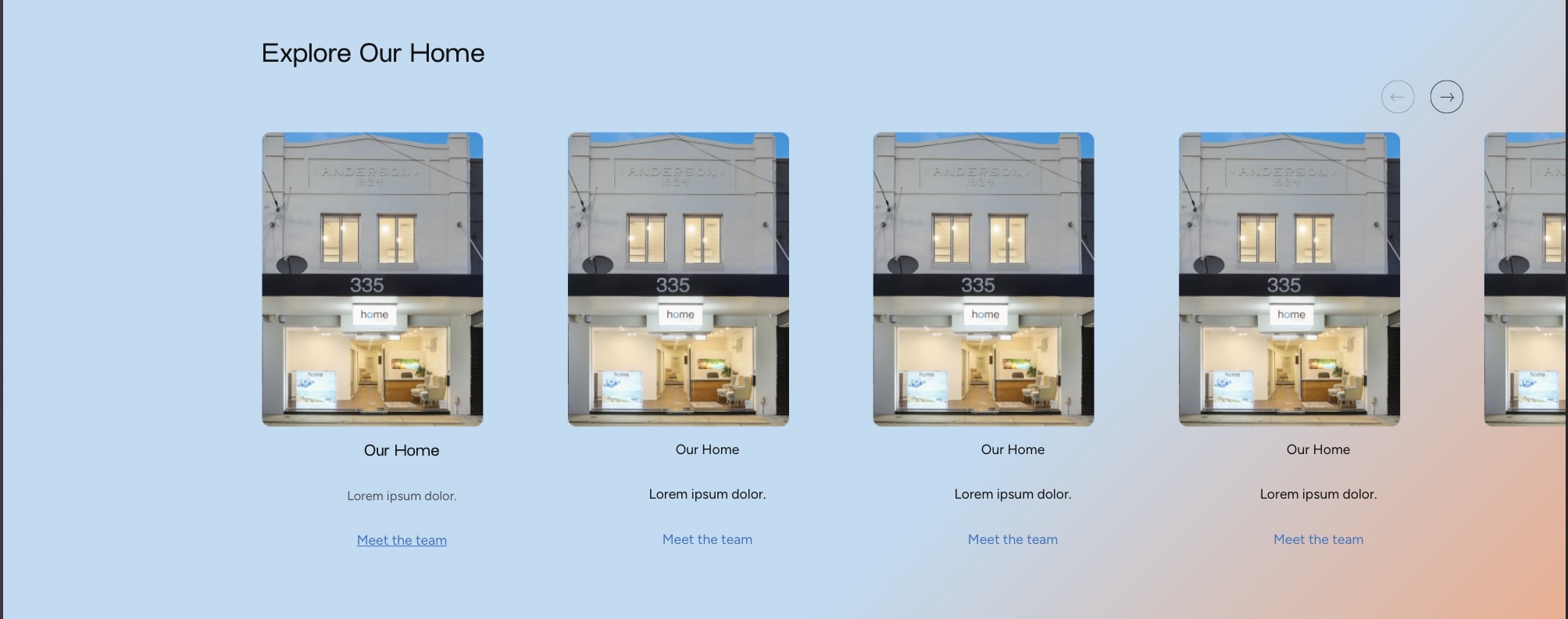
BEFORE
That’s it! When you enable this setting, the plugin automatically handles the Swiper.js configuration (slidesPerView: ‘auto’) and applies the necessary CSS (width: ‘auto’) to each slide on the frontend.
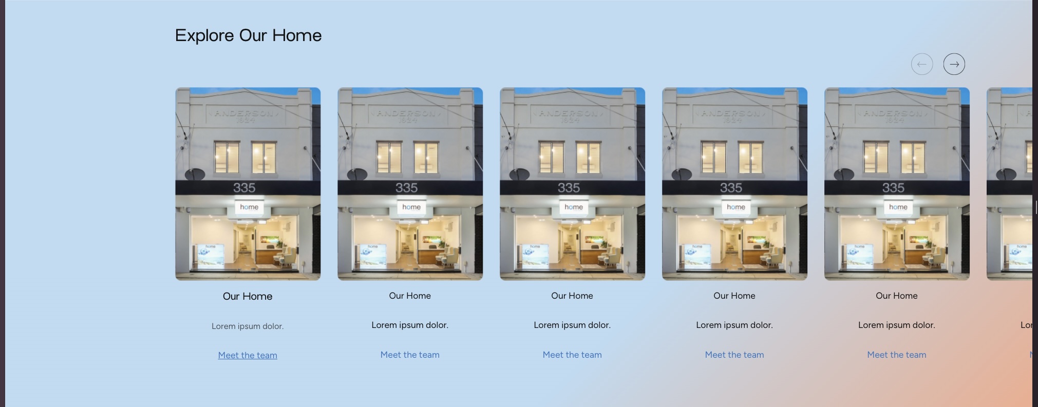
AFTER
Quick tip: If you want slides to visually overflow outside the container, enable Basic Slider Settings → Overflow Visible (true).